Subscription & Earning by Plans
The “Subscription & Earning by Plans” dashboard provides a breakdown of app revenue and user base by each specific pricing plan.
Last updated
The “Subscription & Earning by Plans” dashboard provides a breakdown of app revenue and user base by each specific pricing plan.
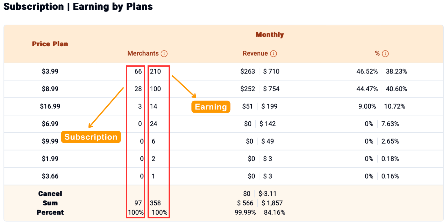
This table indicates a detailed summary for each of an app’s Price Plan. The data is split into Monthly and Yearly sections.
For each metric, there are two columns: the left column represents Subscription data (related to active users), and the right column represents Earning data (related to revenue).

Metric
Subscription Column (Left)
Earning Column (Right)
Merchants
The number of active merchants currently subscribed to that plan.
The number of merchants who contributed to the earnings from that plan.
Revenue
The potential revenue from all active subscriptions on that plan.
The actual revenue earned from that plan within the selected period.
%
The percentage of total active subscribers that are on this plan.
The percentage of total earnings that this plan contributes.
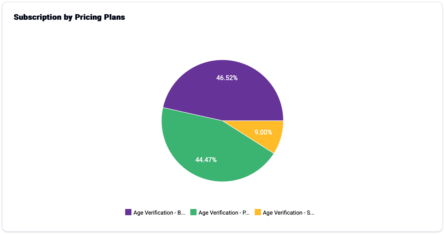
This chart visualizes the distribution of an app’s active subscribers, showing which pricing plans are the most popular among its user base.

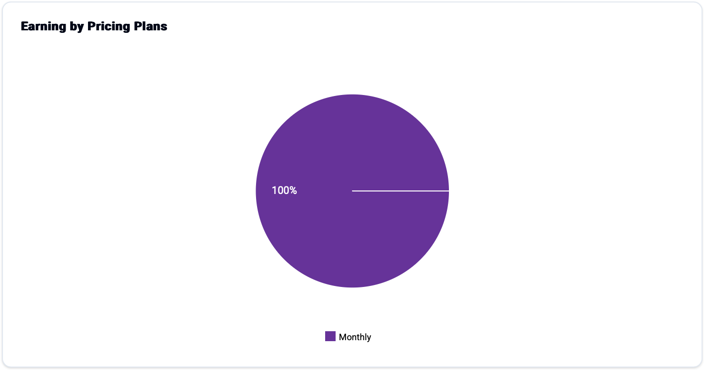
This chart visualizes an app’s revenue streams, showing which pricing plans contribute the most to total earnings.

Identify Key Plans: This breakdown helps you quickly identify which pricing plans are the true drivers of your business. By comparing user popularity with revenue contribution, you can pinpoint your most valuable and strategically important subscription tiers.
Optimize Pricing Strategy: The data provides a clear basis for evaluating and refining your pricing structure. It enables you to assess the performance of each plan, identify opportunities for price adjustments, and make informed decisions to better align your pricing with the value you provide.
Last updated